
What makes a good photograph? An interesting subject matter that no one has seen from this perspective before? A powerful narrative line that carries a meaningful message? The quality of the image, the accuracy of colors, and the beauty of the aesthetic?
Actually, it is all these and something more. A good photo composition needs balance. And if you only associate balance with symmetry, you miss a lot because most of the scenes we frame don’t include symmetries. Nevertheless, you need to create balance even with asymmetrical visual elements. And here is how you do it.
What is Balance in Photography?
Imagine a weighing scale. You have apples on one side and the standard weights on the other. And although you don’t have the same things on both sides, the scale is in equilibrium. Balance in photography refers to having equal amounts of visual weight on either side of the frame.
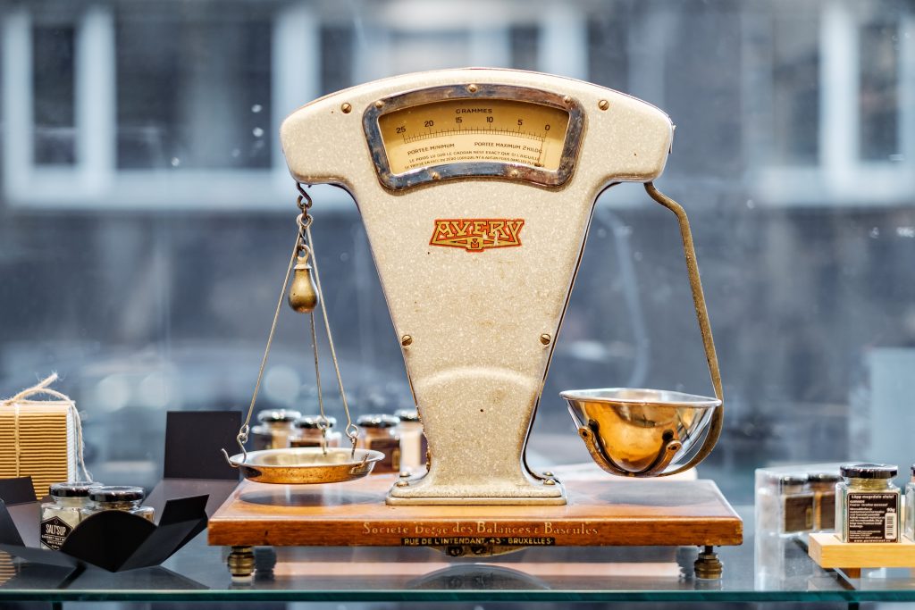
Photo by Piret Ilver on Unsplash
That’s why it’s so easy to associate balance and symmetry. When you mirror an object on both sides of the frame, you create the perfect balance effortlessly. However, you can create balance using different elements too. All you need is to find their visual weights, meaning the visual impact they have on the viewer.
How to Weigh Visual Elements
You may see a photograph as a single scene (e.g., a landscape) or as a collection of objects (e.g., sky, hills, water, grass, subject, and background, etc.), or as a collection of visual elements (e.g., highlights, shadows, patches of color, shapes, lines, textures, etc.).
To create the asymmetrical balance, you need finer granulations, meaning you must see the scene as a collection of objects or elements with different weights. Then, you add the weights of elements from one side of the frame and the ones from the other and check if you have the same visual impact on both sides.
The weight of an object or visual elements depends on the following:
- Characteristics – Some characteristics capture the viewer’s attention more than others. For example, an element that covers a large part of the frame is heavier than a smaller one. The same applies to vivid colors versus monochrome tones, texture versus smooth areas, intense colors such as reds and oranges versus pale colors such as greens and blues, and so on. Check out the table below to find which characteristics are heavy and which are lightweight.
| Heavy | Light |
| Large elements | Small elements |
| Vivid colors | Monochrome |
| Warm colors | Cold colors |
| Dark elements, shadows | Bright elements, highlights |
| Recognizable shapes | Abstract shapes |
| Texture | Smoothness |
| Leading lines | Short, hidden lines |
- Position in the frame – Alongside its characteristics, the element’s position in the frame influences its weight. For example, elements in the foreground are heavier than those in the background. And, of course, elements placed according to any rule of composition become heavier.
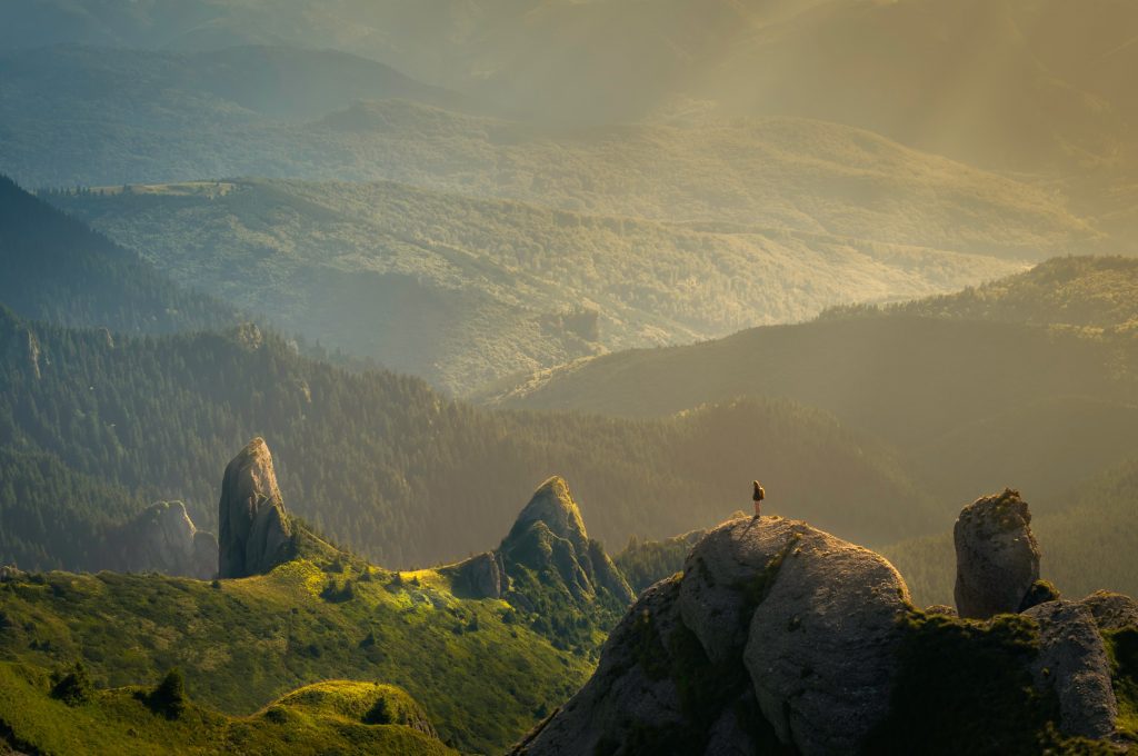
A small element in the right place becomes visually heavier – Photo by David Marcu on Unsplash.
- Relationships – It’s impossible to have a single visual element in a frame. Therefore, relationships form between elements and influence the weight of the group. According to Gestalt principles, humans perceive elements situated next to each other as a group. So, a group of elements becomes heavier than a singular object.
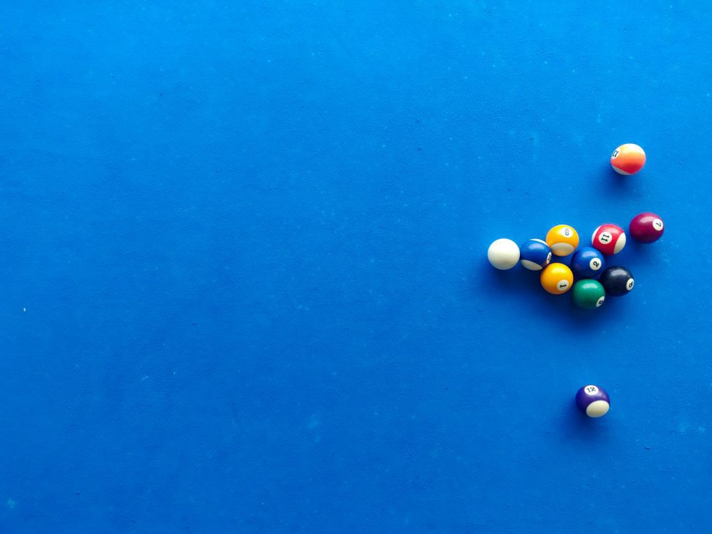
A group of small elements becomes visually heavier – Photo by Saint Rambo on Unsplash.
Furthermore, an element with contrasting components (e.g., a dress in contrasting colors) or a group of contrasting elements is also heavier. Weight increases when we add conceptual meaning and see an element as a source of emotion or association. In short, the weight increases whenever we see something more than just a visual element.
Tools to Create Asymmetrical Balance
After computing the weights of the elements, you are either satisfied and take the photo or not satisfied and need to take action to improve the balance. In most situations, you can try one of the following:
- Change framing – By changing the camera’s position and angle, you change the elements in the frame, their positions, and their relationships. Framing is the best way to adjust balance. It allows you to leave more or less negative space, change the proportion of sky and ground, make a subject more or less visible, and so forth. Framing is your most powerful tool.
- Adjust the depth of field – The depth of field dictates how much of the frame is in focus. As a result, using a deep depth of field, you increase the weight of the background. Using a shallow depth of field, you diminish the importance of the background and create more space around the subject.
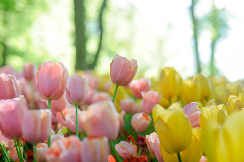
A shallow depth of field decreases the weight of the background – Photo by Giu Vicente on Unsplash.
- Rely on post-processing – If you didn’t get the right framing when taking the photo, you could use a photo editor to change it. Photo editing allows you to crop a well-balanced part of the image, change the aspect ratio, remove unwanted objects, change the color of an element, or blur the background.
Conclusion
Looking to create asymmetrical balance is not something you do from time to time to get a more interesting composition. It’s something you do for most of your pictures. So start with simple objects with no associated meaning and grow from there. It may take some time to master it, but it is a skill that will take your photography to the next level.
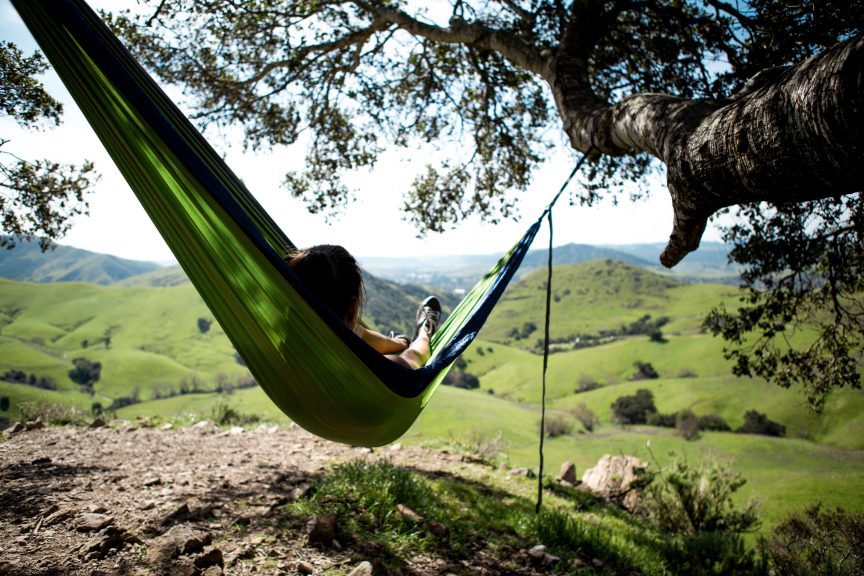
Cover Photo by Austin Schmid on Unsplash