
Color photography allows us to use color actively in our compositions. We can rely on color theory to enhance or reduce contrast, increase or decrease the weight of an object, build a focal point, and create an atmosphere. However, we rarely consider colors individually and lose something of their mesmerizing effect. In addition, it makes photo editing more difficult because we can only rely on intuition and memory when retouching an image. Here, we will examine the power the color orange can add to your photography.
When you know the exact effect of a particular color, you eliminate the try-and-error process and go directly for the effect you need. So here is everything you need to know about the color orange and its use in photography.
The Star of Autumn Colors
We all know how impressive autumn colors can be and how much they impact our photography. Few know that we attribute this quality to the color orange. Not only does it brighten the scenery and allow us to use shorter exposures, but it influences the color of light, creates highlights, and makes everything glow. Without orange, autumn colors would be dark and dull, lack contrast and luminosity, and produce low-mood photos.
Therefore, look for orange when photographing autumn colors and set the exposure for the orange areas. While the darker areas may lose details, the photographs will have that magical autumn twinkle and glowing highlights.
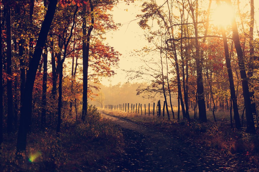
Photo by Lukasz Szmigiel on Unsplash
The Nostalgia of a Sunset
Sunsets are a combination of multiple shades of orange. But it’s not only the scenery that creates the impressive sunset photos. We associate the color orange with warmth and warm-heartedness, with energy and nourishment, and with optimism and confidence. Admiring a sunset wakes up nostalgia for the passing day and enthusiasm towards tomorrow. It makes us reach for the hand of a loved one and share the experience. Orange can fill our hearts with joy, love, and togetherness.
Ensure you don’t overexpose the sunset colors. It’s better if you underexpose everything else. Use a higher ISO value if you need to keep the shutter speed fast, but don’t go over ISO400 because the photos will have ISO noise.
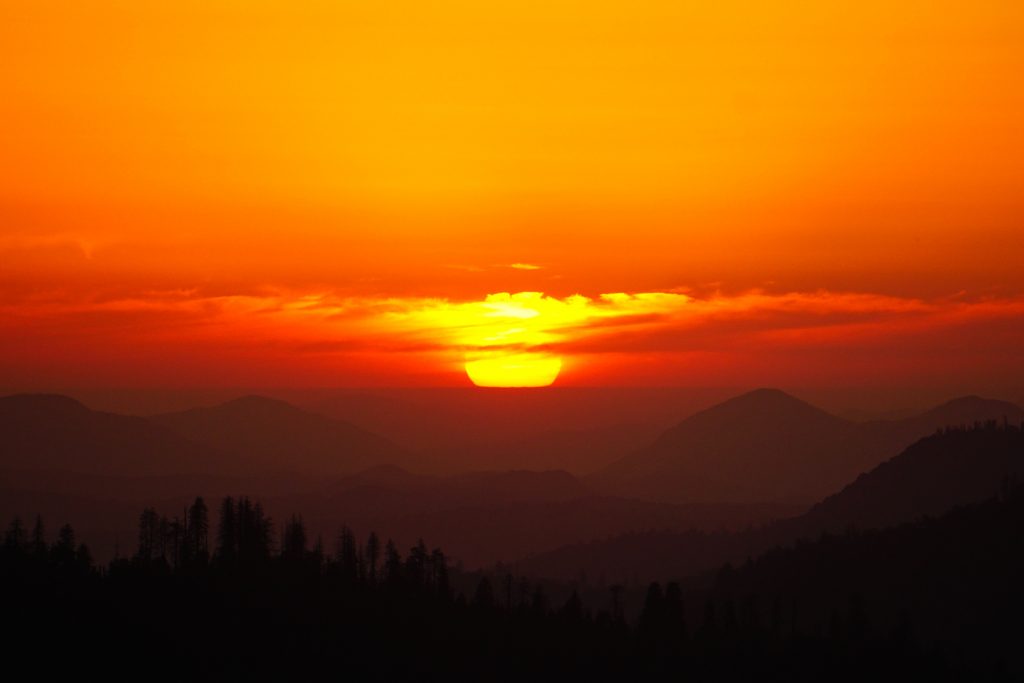
Photo by David Mullins on Unsplash
The Impact of Fire
The color orange is also associated with fire and burning. As a result, people notice it very quickly. If you have a small patch of orange in your composition, you can rest assured that people will look in that direction first. For example, many safety items (traffic cones, life jackets, buoys, etc.) are orange. That makes orange a powerful focal point. It can drastically increase the visual weight of an object; thus, it should be used wisely to catch the viewer’s attention.
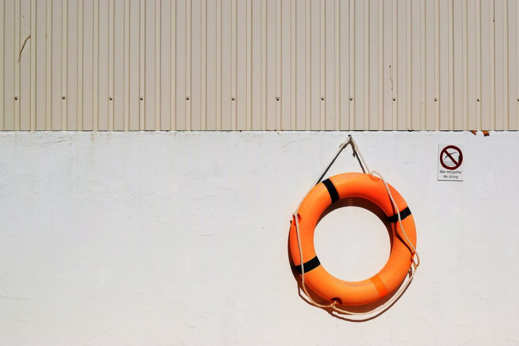
Photo by Matthew Waring on Unsplash
The Vibrancy of Color Contrast
Blue is the complementary color of orange, and together, they provide the highest color contrast you can have. Orange and blue is a combination frequently found in nature. As the sky is blue, any orange object having the sky as a background creates a high contrast. Therefore, it’s a natural contrast pleasing and familiar to the human eye.
Furthermore, orange and blue is a happy combination that conveys joy, optimism, and freshness. It reminds us of sunsets and happy summer days. In addition, it’s flattering for the human skin tones. Orange light smoothes the skin and blurs imperfections while adding a soft glow.
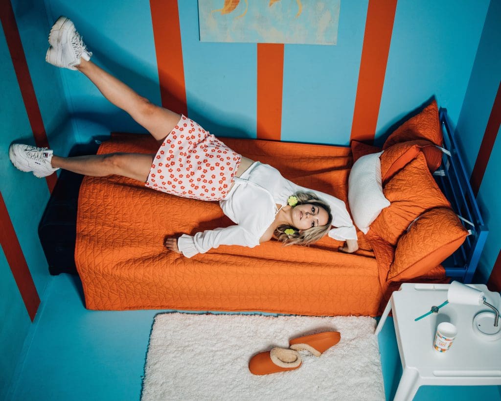
Photo by Kyle Cleveland on Unsplash
Conclusion
Decomposing the scene into individual visual elements is the first step of composing a photograph. Don’t settle with the level of colors and shapes. Dig deeper until you reach individual shades, lines, and textures. Then, consider how each element impacts the composition and decide whether you want it in the frame. These small details perfect your compositions and help you take better shots effortlessly.