We’ve already discussed the vibrancy and contrast that orange brings to our photography. How about the color green? Green is common in nature and is much easier to spot than orange. For a photographer, this may be both good and bad news.
It’s good news because if you want to photograph something green, you only need to look around you. At the same time, it’s bad news because creating a strong focal point using green items is more difficult. People are so used to green that they don’t notice it anymore. However, if you learn to harness the power of green, you can create impressive compositions and meaningful visual stories.
The Star of Summer Colors
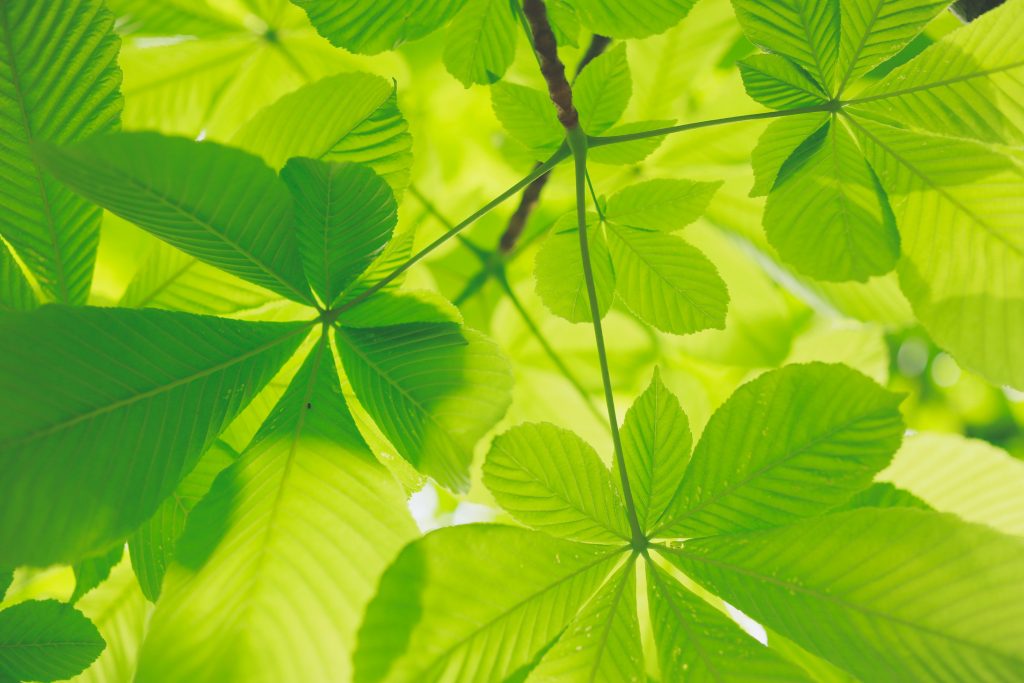
Green is probably the color most associated with nature in the spectrum, and it peaks in the summer months. If you spot the perfect shade of green, you don’t need anything else to fill the frame and create a mesmerizing summer photograph. It may be a field, meadow, tree foliage, hills, or forests.

Photo by Kumiko SHIMIZU on Unsplash
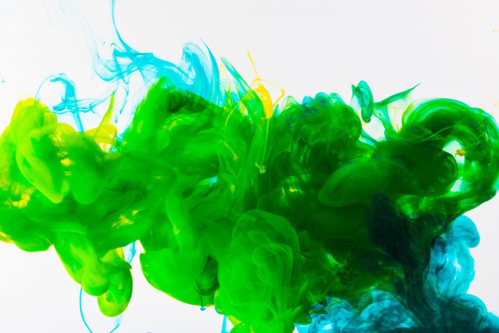
However, you can find summer colors in objects other than landscapes. For example, you can get close to a green item and focus on its texture and pattern. Fabric and painted wood are good choices. The idea is to capture a warm shade of green that resembles the naturalness of summer, the vacation sensation associated with it, and the feeling of freedom, hope, and openness. The color green is perfect for a minimalist approach because it connects us with nature in an intrinsic manner.

Photo by engin akyurt on Unsplash
The Peak of Freshness
Green is associated with freshness, health, growth, and prosperity. There is a reason why you often see Granny Smith apples or limes used as décor in design magazines. A few splashes of green make the space look clean, fresh, and open. Green in photography can do the same for your images.
The idea is highly embraced in commercial photography, such as food and product photography. Adding something bright green to the composition doesn’t distract the viewer from the main focal point but infuses the frame with freshness and healthiness. You can use a green object or background, add a tint of green to your lighting design, or dress your subject in green clothing items.

Photo by iD INTERIORS on Unsplash
The Long-Lasting Calming Effect
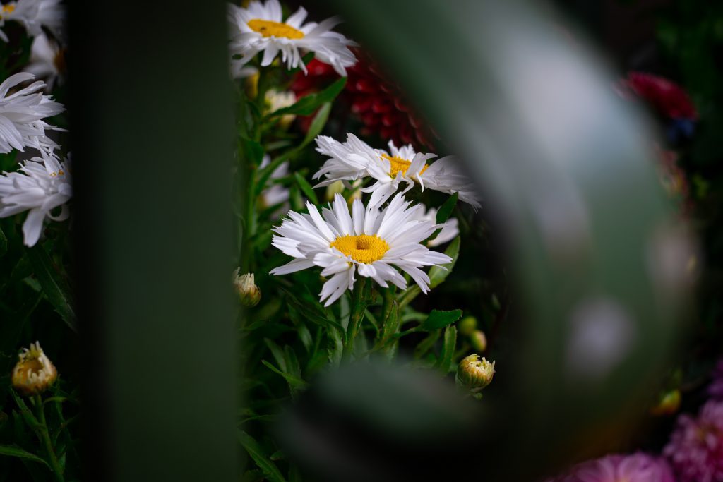
Because the color green is a familiar presence in nature, we trust that it won’t threaten our lives. Green is not a dangerous color, and we can relax around it. Furthermore, in the modern era, green is often associated with soothing effects, spa centers, restorative methods, and other things that improve our physical and mental health. As a result, using green in your photography adds a calming effect that slows down the viewer. Green is the color of balance and renewal.
Pay attention to the shade of green. If it’s closer to yellow, it will be energizing and joyful. If it’s closer to blue, it will be soothing and reassuring.

Photo by Omid Armin on Unsplash
Exposure Green Rule
The exposure green rule helps you create the perfect exposure and vibrant colors whenever you photograph a scene that includes nature. It states that exposing a green area and then underexposing it by two-thirds of a stop creates an even exposure, deeper tones, and the highest level of detail. The green areas will look perfectly green, while purple tones will be more vibrant. The rule also helps you make the subject stand out, avoid overlapping images, and improve contrast and clarity.

Photo by Barthelemy Rigaud on Unsplash
Conclusion: Green in Photography
You can rely on green for a broad range of meaning and artistic effects. Make a habit of noticing the colors that enter the frame and using them wisely. See the story behind each shade, its meaning, and its influence on the viewer. But first, start by noticing the impression a certain color shade makes on you.
Cover photo by engin akyurt on Unsplash

