

Color theory is no stranger for photographers because color is an essential ingredient in photography composition. You already use complementary and analogous colors, take advantage of color contrast, and enhance the visual story with the meaning and weight of colors. Nonetheless, is there a tool other than the color wheel to help you understand colors and their relationships and provide pointers for photography composition and editing? The answer is Adobe Color.
What Is Adobe Color?
Adobe Color is an online tool that allows you to create color themes starting from the color wheel or a photograph. Each color theme has a base color and four others that follow a particular color harmony rule.
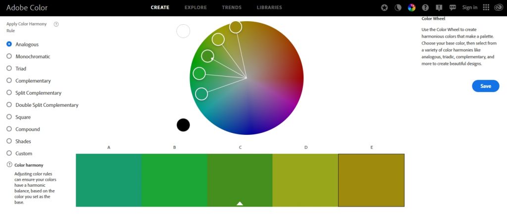
Adobe Color includes the most popular color harmony rules, such as analogous, complementary, triad, square, and shades. But the tool also features more complicated color schemes such as monochromatic, split complementary, double split complementary, and compound. The existence of these variations shows how valuable each tone is and how much you can adjust the relations between colors. The slightest color variation influences your photography compositions and the message you want to convey.
Besides creating color themes according to color harmony rules, Adobe Color provides three more functionalities: Extract Theme, Extract Gradient, and Contrast Checker.
Adobe Color Benefits for Photographers
Adobe Color is useful for photographers who design their compositions and have some control over the colors in the frame. For example, studio photographers may choose the background color using a color harmony rule that flatters the subject (e.g., create color contrast between the background and the model’s outfit, use analogous colors to make a brand’s colors pop out, etc.). Environmental portrait photographers may ask people they photograph to wear a particular color to match the landscape in the background (e.g., beach colors for a family photo session on the beach, white outfits for couple photographs at sunset, etc.).
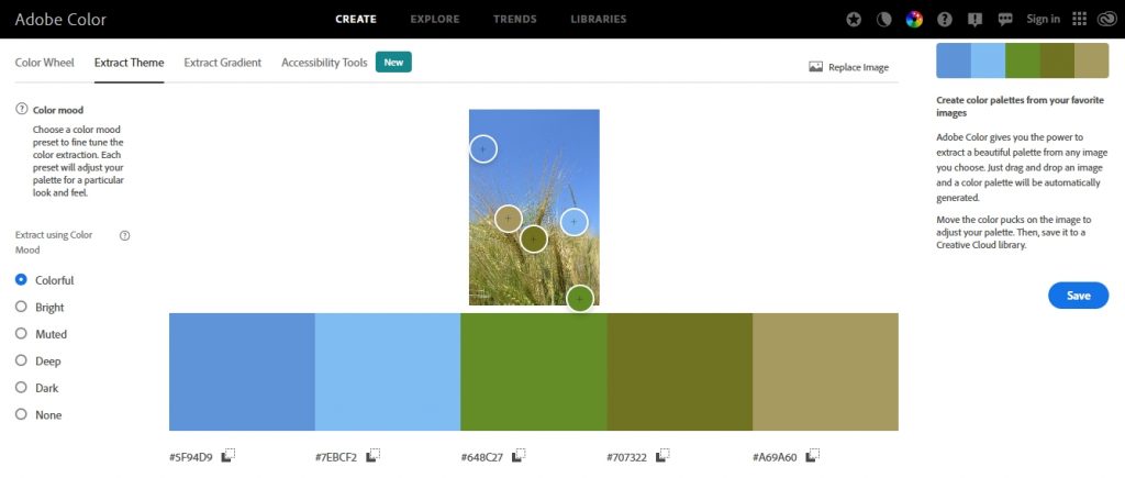
However, photographers who can’t control the colors of the composition benefit as well. Adobe Color’s Extract Theme feature allows you to check the color theme of a photograph and adjust it for a particular mood. You must upload a photograph and select a mood from Colorful, Bright, Muted, Deep, Dark, and None. Adobe Color extracts five colors and lets you fine-tune them as much as you like. Now you have the color theme of the photograph and can use it to edit the photographs from the same photo session, design a photo album or frame, or create mood presets for future editing purposes.
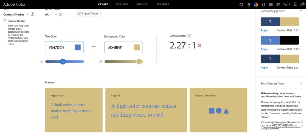
The Contrast Checker is also useful in photography. It provides the contrast ratio between two colors in an image. It helps you decide whether the composition needs adjustments (e.g., changing the background to something more contrasting, increasing color contrast in post-processing, etc.).
Conclusion
Adobe Color is easy to use and consult whenever you need advice regarding a composition’s color scheme. It’s free, accessible from any device, and syncs with all other Adobe apps. Furthermore, it improves your color acuity and understanding. Adobe Color outlines the latest trends, offers collections of color themes categorized by mood or keywords, and provides a memory color game. So immerse in color and learn to see the beauty that surrounds you.
Cover photo by Hannah Morgan on Unsplash