
Like orange and green, the color we’ve discussed so far, blue is a color that’s easy to spot in our natural environment. Just look up on a sunny day, and you’ll see the blue sky waiting for you to photograph it. There are also oceans and lakes, flowers, and even birds that wear pretty shades of blue.
So, finding something blue to photograph is not an issue. However, the challenge begins when you want to mix the color blue with other colors and create harmonious compositions. Read along to find out how to make the most of your artistic encounter with the color blue.
Best Background Award
A clear blue background for a subject in shades of orange, yellow, or red creates the most powerful color contrast possible. Because blue is a cold color, the viewer will prefer to look at your warm color subject. There isn’t a better way to make your subject stand out and capture the viewer’s attention.
Furthermore, if you use natural blues, such as the sky or a large body of water, the naturalness of the shade will create an even more soothing and less disturbing background. Always go for the sky when photographing outdoors if you can’t find a suitable background.
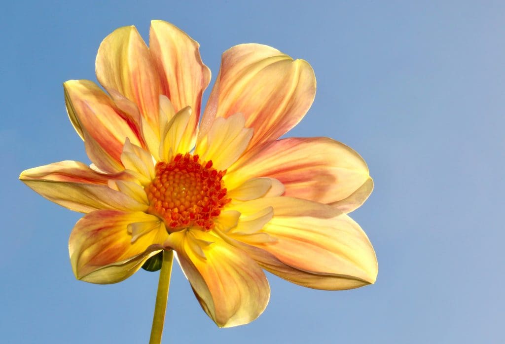
Photo by James Wainscoat on Unsplash
A Serene Expectation
Color psychology considers blue a calming color. For that reason, you’ll see plenty of blue (especially light shades) in interior design, hospitals, and spa centers. Blue is associated with water, which is the source of life. Therefore, blue usually isn’t visually striking and has a reduced visual weight. If you want it to make a point, you need to increase its weight by using large blue surfaces, recognizable blue shapes, or a closer position to the camera.
On the other hand, if calm is the emotion you want to convey, using analogous shades of blue is the answer. Mix water and sky, clouds and sky, layers of mist, and blue items and backgrounds. That’s no wonder that beach landscapes make us dream of a relaxing vacation.

Supreme Coldness
Water produces the most impressive shades of blue when it is frozen. Icebergs have a unique turquoise shade that makes you feel the cold from afar. As a result, blue can convey coldness like no other color.
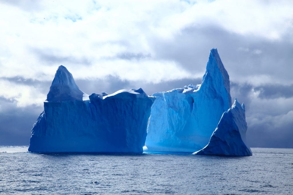
Photo by Danting Zhu on Unsplash
Whether it is a blue glass, a blue summer dress, or a blue sun umbrella, they all give us the impression of something that will cool us down. So incorporate blue whenever you need to add a temperature level to your pictures.
Blue Hour Effect
Blue hour is the last hour before sunrise and the first hour after sunset. It’s when the sun isn’t up yet, but it is close enough to color the sky and provide a blue light. Blue hour is one of the landscape photographers’ preferred times of the day because it creates dramatic scenery. All stories start or end during the blue hour. Furthermore, the natural world is very active around this time.
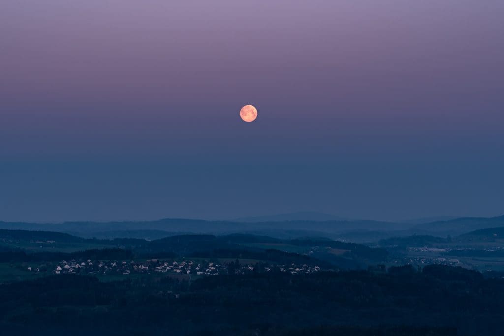
Photo by Pascal Debrunner on Unsplash
Blue Hour is also a good choice for astrophotography. A little bit of light makes exposure easier, but you can still see the Moon or a few stars.
In terms of emotions, the blue hour conveys sadness, loneliness, and coldness. Ensure you use its power correctly.
Conclusion
Blue is in your photography compositions even when you think it isn’t. It’s discrete and visually lightweight, but it can considerably influence your work once you release its power. You can use it as a trustful supporting actor or as the star of the frame. Experiment with different shades of blue and see what each brings and how they change the photo’s meaning.
Cover photo by Steve Johnson on Unsplash