
Nature offers a broad color palette that influences our actions, moods, and emotions. Some colors are soothing and relaxing, while others catch our attention and raise our adrenaline levels. Because nature is the best at balance, mellow colors are in large proportions, and strong colors are in small proportions. The color red is in the latter category. You can find it in small amounts in a natural environment, but it makes a big impact.
Best Focal Point in Sight
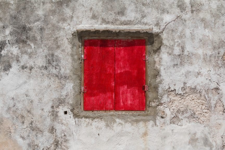
The color red is equally attractive to humans, animals, and insects. Therefore, red items make exceptional focal points. Even the smallest red spot in a frame will make the viewer look in that direction. As a result, if your subject matter is red, chances are it will be in the spotlight.
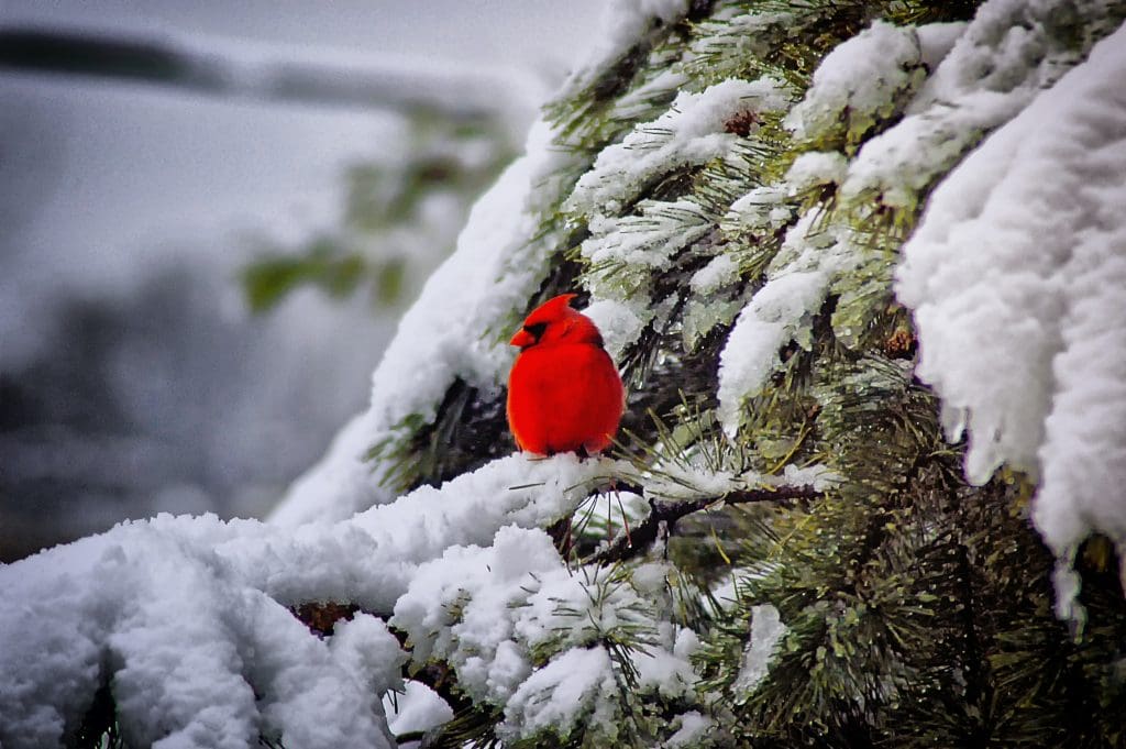
Photo by Robert Thiemann on Unsplash
However, the power of the red color makes it visually heavy. This means a small amount of red must be balanced with large amounts of other colors or negative space to produce a well-balanced composition. It also means that if the red object is not your subject matter, you should be very careful where you put it in the frame so as not to steal attention. Use the rule of thirds and other composition rules to balance the frame accordingly.
Contrast, Contrast, Contrast
Because it is so visually striking, red provides an excellent contrast in the vicinity of green and blue. You can also create saturation contrast by putting red, a vibrant color, next to gray, black, or white. Red provides many features that help you create an interesting composition. Use them wisely.
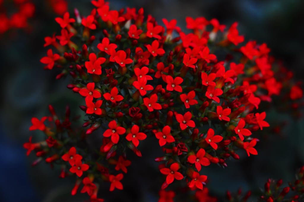
Photo by Abuzar Xheikh on Unsplash
High Heart Rates
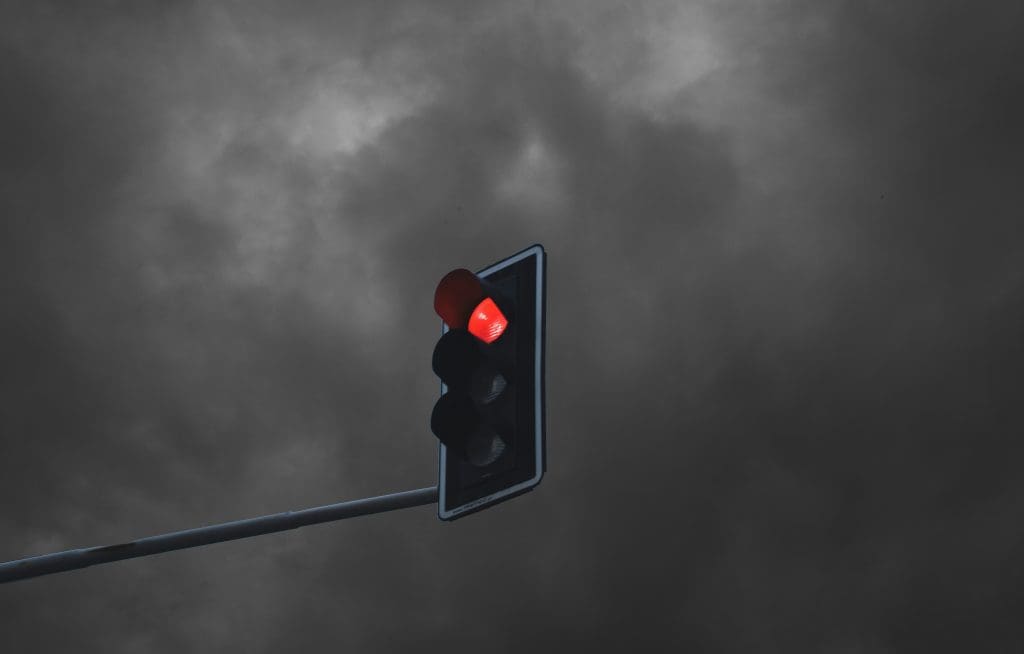
Red is associated with powerful emotions, both positive and negative. It is the color of blood, which makes it a symbol of sacrifice and love but also pain, death, and anger. In nature, many poisonous plants disguise themselves in shades of red to attract insects, birds, or animals. Over time, humans have learned to stay away from red mushrooms, for example. As a result, red is also associated with danger. And because it is so visible, red is used for stop signs, hydrants, sirens, and traffic lights.
Regardless of its positive or negative meaning, one thing is clear: red raises your heart rate in excitement, fear, or anger. So be aware of this power and use it as an additional layer in storytelling.
Supreme Hotness
Don’t forget that red is the color of fire and, therefore, it conveys warmness. An interior with red objects will be perceived as warmer than one decorated in shades of blue. A person dressed in red will be perceived as more passionate and fiery than one dressed in green. These small details help you set up a portrait or real estate photo session. The human mind can be easily tricked. A simple red mug will tell the viewer that the content of the mug is hot!
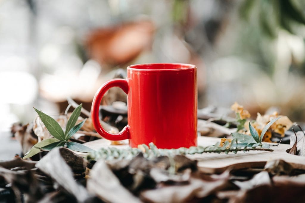
Photo by Jethro Carullo on Unsplash
Conclusion
The color red has a powerful symbolism that doesn’t go unnoticed. It will speak for itself whether you like it or not. So don’t overlook it and give it a role in your compositions. Once you learn how to decompose a scene into basic visual elements and give each a role, you can tackle any scene, whether in a natural environment or a human-made one.
Cover photo by Stephen Pedersen on Unsplash