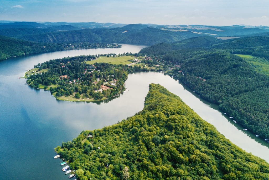
Although landscape format was named with landscape photography in mind and although many landscape photographers use it, it’s not always the go-to option. Portrait format may be a much better choice in some situations. Furthermore, changing the image orientation in post-processing affects composition and image quality. You need to be sure from the moment you press the shutter release which image format works better for your photograph. Here are some tips for choosing landscape vs portrait image orientation when taking landscape photographs.
Landscape vs Portrait
Landscape photographs usually have large subjects and a deep depth of field. The entire frame is in focus and contributes to the effect of the image. However, landscape photos should have a focal point, an element, or an area that catches the viewer’s attention and creates the main attraction of the picture. Choose the orientation of the image based on the main element’s features. If it’s taller than is wider, choose the portrait format. If it’s wider than is taller, choose the landscape format. The best example is a waterfall. If it’s a temporary spring waterfall, thin and tall, it looks better in a portrait format because it will make it look taller and more imposing. If it’s a waterfall that spreads over rocks and creates a curtain of water, it looks better in a landscape format that captures both its grace and the surroundings.
Photo by Chris Czermak from Pexels
Leading lines
If your landscape has strong leading lines, the image format you choose should match the geometry of the line. The viewer will follow the line whether you want it or not. If the line exits the frame quickly, the viewer will not pay attention to much of your composition. Make sure the image orientation allows the line to cross the entire frame and take the viewer everywhere. Rivers, paths, narrow valleys between mountains, and roads act as strong leading lines in landscape photography.
Negative space
There is another leading line that appears in many landscape photographs: the horizon. It’s a powerful horizontal line that divides the image into two areas. According to the rule of thirds, the composition looks better and well-balanced if you place the horizon at one-third of the image. If one of the two areas created by the horizon line is empty and uninteresting (e.g. a plain blue sky), you should favor the other one and give it two-thirds of the image.
Thinking in terms of wider versus taller, the horizon looks better in a landscape format composition. However, this isn’t always the case. The camera transforms a 3D perspective into a 2D picture. When you photograph a flat landscape such as fields, beaches, and oceans, there is a good chance to lose the 3D perspective. For these pictures, choosing between portrait and landscape format becomes essential. The portrait format is more unusual, more different than the way people see the scenery in real life. It also lengthens the perspective, making it more dynamic. It focuses the eye on the horizon line and emphasizes details.
Photo by Ricardo Esquivel from Pexels
Don’t treat all your photographs the same. Rules are good but don’t transform them into clichés. Landscapes are amazing subjects and they should fill the frame and be the main characters of your photos. But you have to look closely at their features, respect their geometry, and capture their natural perspective. When people look at your landscape photos they should feel surrounded by nature, see the mountains above them, and hear the ocean waves. It should be a complete experience. So don’t be afraid to rotate the camera and choose a different angle for each composition. For other techniques check out these articles.
Cover Photo by JESHOOTS.com from Pexels

