Contrast is a powerful element in a composition. When you place two opposite elements next to each other they become more visible and meaningful. Using contrast wisely increases the quality of composition and transforms mundane objects into characters. It also improves the aesthetics of a photo and delivers more artistic images. Here we will explore the five types of contrast in photography.
Almost all photo editors, free and expensive, offer contrast adjustments. But their understanding covers just the basic black versus white contrast. The composition and the story behind your photo are created in the camera and, before that, in your imagination. Don’t expect a photo editor to solve composition and meaning mistakes. In order to understand contrast, you need to know where to find it, because there’s much more than black and white in a photo.
Tonal contrast
Let’s start with the basic black versus white contrast, alias the tonal contrast. You can easily notice how placing black near white catches the eye and how similar shades of gray get unnoticed. The best way to practice tonal contrast is by taking black and white photos. Use colored filters to enhance contrast for different parts of the same scene and observe how you can add drama to composition by increasing the amount of contrast.
But tonal contrast isn’t just about black and white pictures. Colors also have bright and dark shades. You can find tonal contrast in the blue shades of the ocean, the green shades of the forest, or the brown shades of the desert. Play with bright and dark areas of any color and see how the amount of light influences the message you want to convey.
Color contrast
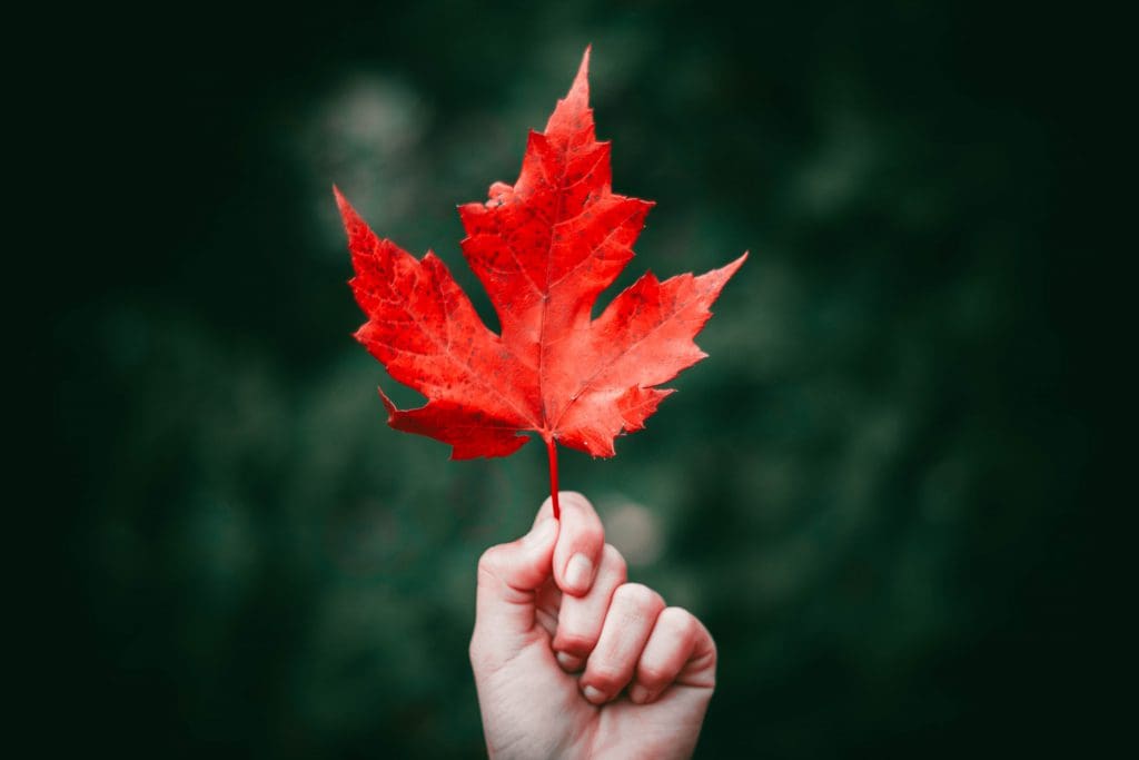
Color contrast is the difference in luminance between two colors and it’s given by the color model you use. Because we usually work with digital photos and the RGB model, you should consider it. In color theory, the biggest contrast between two colors is between complementary colors such as red and green, yellow and blue, cyan and magenta. You can find opposite colors using the color wheel, a chart that represents relationships between colors originally showed by Sir Isaac Newton in 1666.
Color contrast is even more powerful than the tonal contrast in terms of meaning and catching attention. When you place two bright, opposite colors next to each other you create a strong compositional element that won’t get unnoticed. So pay attention to colors and how can they influence your composition.
Pattern contrast
Another way of creating contrast is by placing two opposite patterns together. Think about perpendicular lines, textures with different orientations and granulations, patterns with very different components and colors. Patterns are catchy due to repetition. When you place together opposite patterns you emphasize the repetition and extend their geometric representation.
Photo by Dimitry B on Unsplash
Size contrast
You can work with different perspectives and angles to change the size and significance of your subjects. But size is also a term in contrast. For example, you can have a large, plain blue sky and a single small object in the foreground. Due to the size contrast, the shape of the object will be very visible and attractive. If you collaborate size with other types of contrast, for example, color, you can create very powerful compositions with just a few elements. It’s the art of minimalism.
Photo by Antonino Visalli on Unsplash
Conceptual contrast
In photography, conceptual contrast is the most powerful and meaningful. You don’t work with luminosity, color, or geometry anymore. You work with people’s expectations, feelings, and knowledge. Conceptual contrast refers to socially acknowledged differences such as age, race, sex, and wealth; mood differences such as happiness, sadness, anger, and joy; and attitude differences such as interest, indifference, curiosity, and disdain. In almost all types of photography, you’ll find conceptual contrast from commercials to documentaries. Photography is art for people and their inner strengths and flaws are always in focus.
Photo by Paolo Bendandi on Unsplash

